Pastel Is for Cowards: The Visual Language of Rebellious Luxury
Every brand today rolls off the same pastel template. Asi Luks doesn't chase trends, it builds character. On a visual language where obsidian, chrome and hardness meet emotion, where math meets feeling.
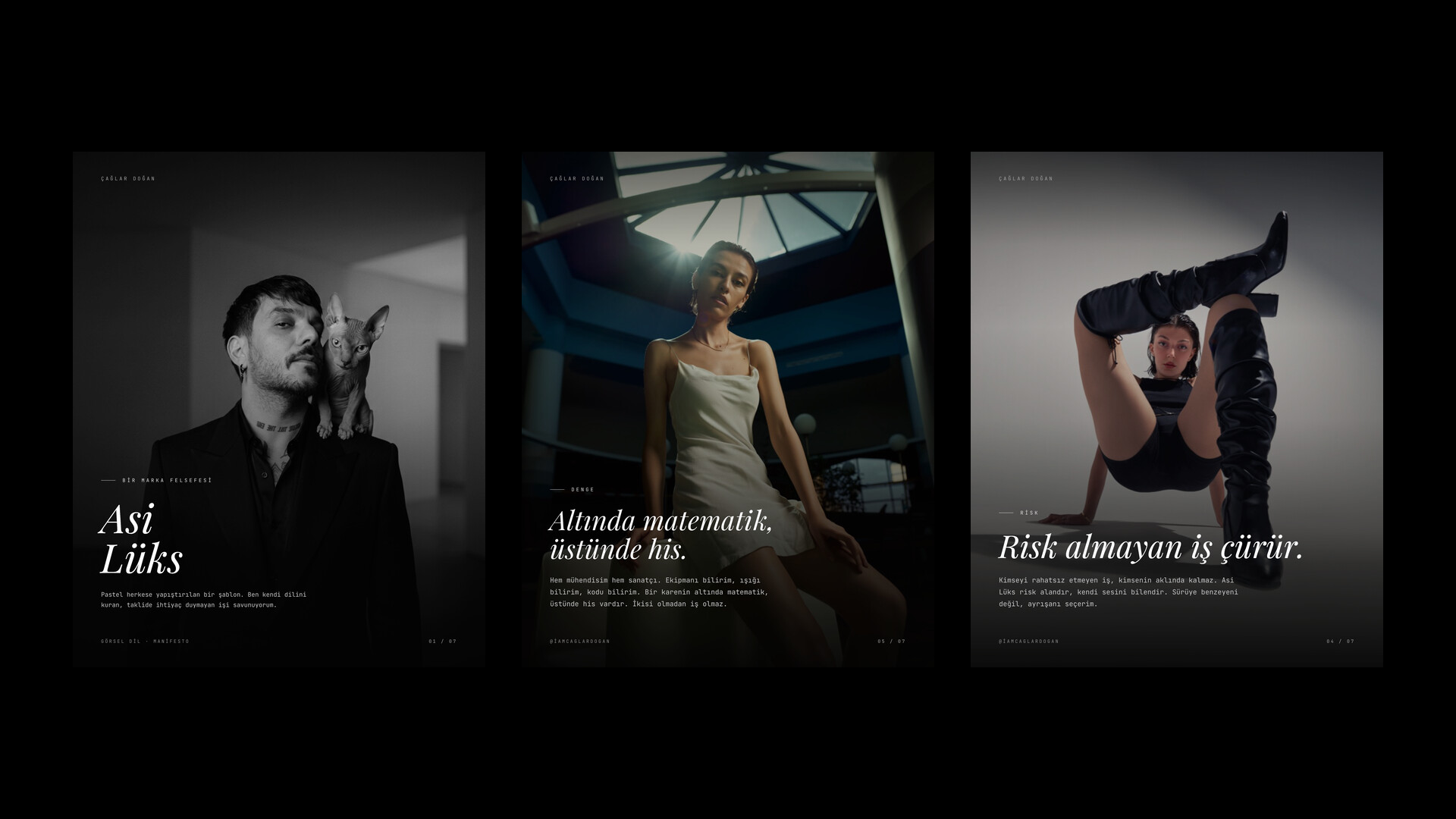
Every brand looks the same now.
Same sans serif headline. Same five percent gray background. Same soft light. Same pastel palette. Same template that offends no one, that sticks to everything. Today everyone says minimalist, everyone says premium, everyone says luxury. It all comes from the same place.
Pastel is for cowards.
I say it harshly because I believe it. Pastel isn't luxury, it's the imitation of luxury. An aesthetic that takes no risk, hurts no one, tries to please everybody. It gets chosen because it's safe. But safe doesn't stick. Work that offends no one stays in no one's mind.
My name for the alternative is Asi Luks: Rebellious Luxury.
Rebellious Luxury isn't quiet, and it isn't reckless either. It's work that trusts itself, knows its own language, needs no imitation. There's obsidian in it, there's chrome, there's hardness. But there's emotion too. Because I'm both an engineer and an artist. I met a computer at seven, I've lived with a camera for seventeen years. I know the gear, I know the light, I know the code. But above all, I know character.
Beneath a frame there is math, above it there is feeling. Light is an equation; angle, distance, intensity, all of it gets calculated. But the thing that presses the shutter isn't calculation, it's instinct. Without both, there's no work. With only math, the frame stays cold. With only feeling, the frame falls apart. Rebellious Luxury stands exactly where the two intersect.
I don't chase trends. I build character. A trend goes stale in six months, character stays. When you look at a brand and ask "who is this," if a clear answer comes back, there's character there. Most brands don't have that answer, because most brands were built trying to look like someone else.
Rebellious Luxury rejects the softness of pastel, but it rejects coldness too. Hard but emotional. Luxury but not sterile. Not looking expensive, but looking sure of itself. That's the difference.
I won't hide that I'm spoiled either, because here spoiled is an attitude, the name of a certain quality. The ordinary blends into the herd. The rebel knows its own voice.
The ordinary passes. The rebel stays.